 Seamfold
How to make a seamless carousel
A seamless carousel is one wide picture cut into equal panels that line up when people swipe. To make one, design a single canvas that is as wide as all your slides together, cut it into panels of the same size, save them in order and select them 1 to last in the composer without re-cropping.
Coming soon to iPhone
What makes a carousel seamless?
The idea is simple. Instead of making four separate slides, you make one image and let the swipe reveal it in slices. A skyline, a table, a long headline or a path continues across the cut, so the next panel feels like the same picture sliding in.
A printed gatefold works the same way: one artwork that spans a folded sheet (Wikipedia: Gatefold). The only difference is that your fold lines are invisible and live between panels.
What do you need before you start?
Three numbers decide everything: the panel size, the panel count and the source width. The social app accepts up to 20 slides in a carousel since the August 2024 expansion. A panel is 1080 px wide in the common formats, so a 4-panel spread is 4,320 px wide.
| Panels | Spread width at 1080 px per panel | Height at 4:5 (1350 px panel) |
|---|---|---|
| 2 | 2,160 px | 1,350 px |
| 3 | 3,240 px | 1,350 px |
| 4 | 4,320 px | 1,350 px |
| 6 | 6,480 px | 1,350 px |
| 10 | 10,800 px | 1,350 px |
How many panels should a seamless carousel have?
Three to six panels suit most posts. Two panels make a short reveal, and past six the viewer has to commit to a long swipe before the picture pays off. The social app allows up to 20 slides, but a limit is not a target.
Your source photo often settles the number for you. Divide the photo's width by its height, multiply by the panel height in panel widths (1.25 for 4:5, 1.33 for 3:4, 1 for a square), and round. A 6000 x 2400 px photo has a 2.5 ratio, so at 4:5 it fills 2.5 x 1.25, about 3 panels. Seamfold uses this same arithmetic when you pick a single wide photo, then caps the result at the limit of your plan.
How do you make one, step by step?
Seamfold is built around exactly this loop. You edit one spread with dashed fold lines, and it saves the panels to Photos in order. See the panorama splitter.
- Choose the ratio: 4:5 for the standard feed portrait, 3:4 when you want the grid tile to match, 1:1 for squares.
- Pick the panel count. A wide panorama suggests its own count, and a set of photos works with a layout that puts a photo on each fold.
- Compose the spread on one canvas. Move photos, add text and keep important words away from the folds.
- Cut the canvas into equal panels on exact boundaries. A crop that is one pixel off shows as a hairline gap or a repeated strip.
- Export every panel at the same size and in order, panel 1 first.
- Post: open the composer, select panel 1, then the rest up to the last. Do not zoom or drag in the composer.
Can you do it with a desktop editor instead?
Yes, and the steps are the same. Any editor that has a canvas, guides and a crop tool can make a seamless carousel. Set the canvas to panels x 1080 px wide, drag a guide to every multiple of 1080, place your pictures, then export each slice at the exact same size.
The cost is repetition. You crop and name every panel by hand, a single typo in the width shifts all later cuts, and you have to move the files to your phone before posting. A phone app removes those steps, but the result on social media is identical if the pixels are identical.
| Step | By hand in an editor | In a phone app |
|---|---|---|
| Set the canvas | Type the total width yourself | Choose a ratio and a panel count |
| Mark the folds | Drag guides to every 1080 px | Dashed fold lines appear automatically |
| Cut the panels | Export slices one by one | One Save puts every panel in Photos |
| Order | Name or sort the files | Saved panel 1 first |
| Get them to the phone | AirDrop or cloud sync | Already on the phone |
Which mistakes break the seams?
Most failures happen after export. The list below covers the usual causes.
| Problem | Cause | Fix |
|---|---|---|
| A gap or double strip at the cut | Uneven crop widths | Cut on exact equal widths |
| Panels shifted after posting | The composer re-cropped the image | Keep the exported ratio, do not pinch |
| A word split in two | Text on a fold | Move text off the fold, or use seam check |
| Soft, blurry slides | Source too small for the panel count | Use a source near 1080 px per panel |
| Panels in the wrong order | Selection order in the composer | Select 1 to last |
What do you do when the panels still do not line up?
Start with the composer, because that is where most breakage happens. Work through the steps below in order and stop at the first one that fixes it.
- Close the draft and start the post again so no earlier crop remains.
- Select the panels from 1 to the last, tapping slowly so the numbers appear in order.
- Leave the crop frame alone. Do not pinch, zoom or drag any slide.
- Check that all panels share one ratio. If one was exported at a different size, export the whole set again.
- Compare with the editor. If a seam is off inside the editor too, the cut is the problem, not the composer.
How do you keep the picture sharp?
A small source stretched over many panels turns soft. A rule of thumb from carousel guides is about 1080 px of source per panel, so 4 panels want roughly 4,320 px. The social app also re-compresses uploads, so export the cleanest file you can and avoid editing the panels again in another app.
If your panorama is narrower than that, use fewer panels. Two crisp panels beat six soft ones.
Which picture ideas work best?
Not every photo suits a swipe. The ones that do give the eye a reason to keep moving, and they carry a clear line or object across the cuts.
- A wide landscape or skyline, where the horizon runs through every panel.
- A table or desk shot with objects spread along it, so each panel adds a new item.
- A set of photos with one object placed across each fold, so the next swipe completes it.
- A long headline that reads across two or three panels.
- A before and after pair that meets in the middle.
How should text work across a carousel?
Keep each word on one panel unless the effect is the point. Text that is cut by a fold forces the eye to rebuild the word on the next swipe, and at normal reading speed that fails. A long headline that is meant to travel across panels works only when it is large, short and readable in each slice.
Leave a margin of a few percent of a panel's width on each side of a fold. In Seamfold, seam check uses a margin of about 4 percent of a panel and counts every text layer that crosses a fold. Treat the count as a prompt to look, not as a rule. If the Headline across layout is what you want, keep it.
How do you check the result before posting?
Page through the panels the way a follower will, slowly and then quickly. Look for text that lands on a fold, objects that look cut in half by accident and a first panel that works alone in the grid. Swipe test in Seamfold does this in a generic post frame, and it ends with a row that shows your cover among three grid tiles.
If you plan to announce the post in stories, a short teaser helps people know to swipe. See the teaser card.
A short checklist before you post
- All panels have the same size and were exported in one batch.
- Panel 1 is selected first in the composer, then 2, 3 and so on.
- No pinch, zoom or crop was applied in the composer.
- No important text sits on a fold or near the edge of panel 1.
- The caption is ready, since it applies to the whole post.
Does the first panel need special care?
Yes. The profile grid shows the first panel as a 3:4 tile, so a title near the edge can be trimmed there. Check the cover before you post. The 3:4 grid cover guide has the numbers, and swipe test lets you page through the result first.
A worked example with a desk photo
Say you shot a desk from above: laptop on the left, a coffee in the middle, a notebook on the right. The photo is 5400 x 1500 px, so its ratio is 3.6. At 4:5 that gives 3.6 x 1.25 = 4.5, which rounds to 5 panels, or 4 on the free plan.
At 4 panels the spread is 4,320 x 1,350 px and the photo fills it with room to spare. Panel 1 shows the laptop, panel 2 the coffee, panel 3 the notebook, and panel 4 a blank corner that fits a short line of text. Put the line inside panel 4, away from the fold, and run the swipe test before you save.
Can a phone app do all this?
Yes. A phone is enough because the work is cutting and ordering, not heavy editing. The free plan in Seamfold covers 2 to 4 panels, and the app saves with add-only permission to Photos, so it never reads your library. Seamfold is still in development, so check the features page for what is planned at release.
Is there a mark on the panels?
On Seamfold's free plan the last panel carries a small "made with Seamfold" mark in the bottom right corner. Pro turns it off by default. If the mark would land on part of the picture that matters, add a plain strip of background or move the subject, because the mark is placed by the app and not by you.
Frequently asked questions
How many slides can a carousel have?
Up to 20, after the August 2024 expansion.
What size should seamless carousel panels be?
1080 px wide each. Height is 1350 px for 4:5, 1440 px for 3:4 and 1080 px for 1:1. See the size guide.
Why do my carousel panels not line up after posting?
The composer probably re-cropped them, or the panels were selected out of order. Keep the exported ratio and select 1 to last.
Do I need a desktop editor to make a seamless carousel?
No. Any tool that cuts equal panels from one canvas works, including a phone app. A desktop editor only adds more manual steps.
Can I make a seamless carousel from several photos?
Yes. Place one photo across each fold so every swipe pulls the next one in. Seamfold's Bridge layout does this.
How many panels should a seamless carousel have?
Three to six work for most posts. Past six the swipe gets long, though the social app allows up to 20 slides.
Keep exploring
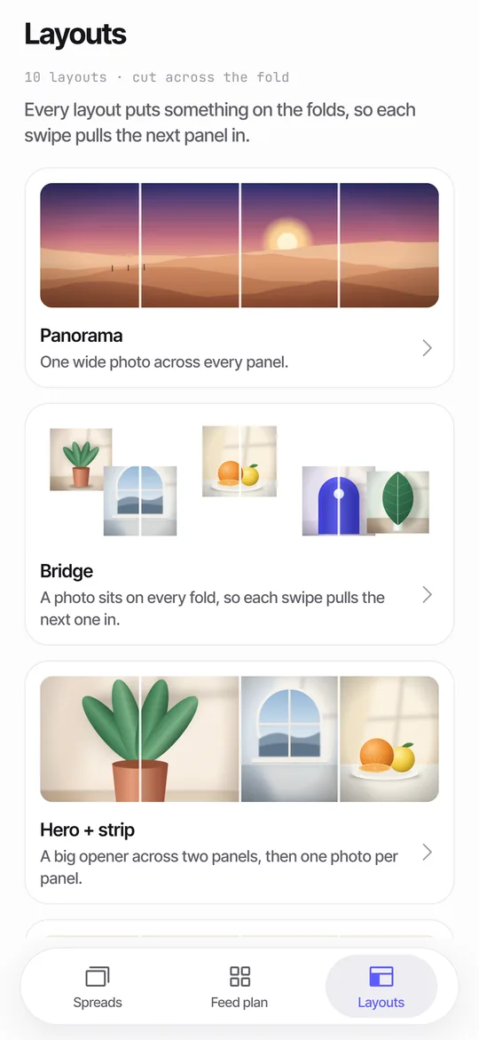 Panorama Splitter for Social Carousels on iPhoneCut a panorama into 2 to 20 panels, or build a spread from several photos with 10 layouts.
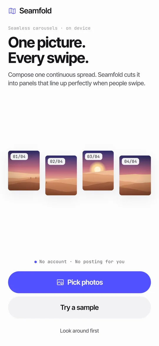 How to Split a Panorama for a Carousel, With SizesPanel counts, pixel widths and the steps to cut a panorama into a carousel.Carousel SizeSizes for 4:5, 3:4 and square carousel panels, slide limits and how to choose.Continuous Carousel in an Image EditorThe manual method with canvas sizes, guides, slicing and export, plus where a phone app saves time.How to Make a Photo Collage Carousel on iPhoneLayouts, steps and checks for a multi-photo collage carousel built from one continuous spread.