 Seamfold
Swipe the carousel before anyone else does
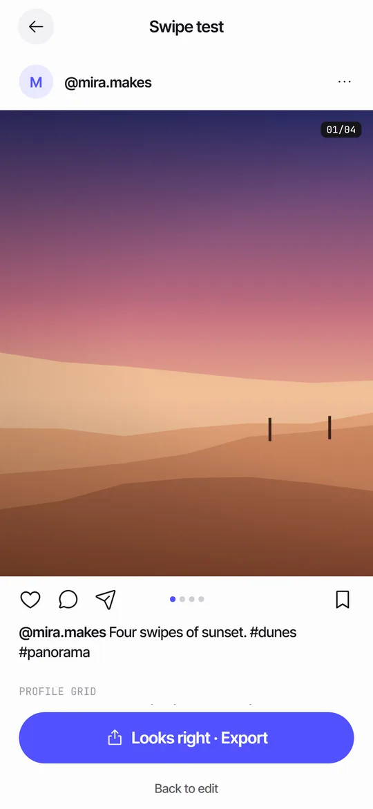
Swipe test shows your panels in a generic post frame so you can page through them the way your followers will. You see page dots, a 1/4 counter, a caption preview and a row with your cover cropped to a 3:4 tile. When it looks right, you export from the same screen.
Coming soon to iPhone
What does the preview show?
A horizontal pager shows one panel per screen width, with dots and a counter in the corner. Under it sit a generic action row, built from simple line icons rather than any platform logos, and your caption in two lines with a more link.
The avatar and handle come from the handle you set in Settings. Leave it empty and the preview uses your_name.
The preview posts nothing. The frame is a local preview inside the app. Seamfold has no connection to any social network and never uploads your panels.
How do I run a swipe test, step by step?
The whole test takes under a minute. It is worth doing after every layout change, not only once at the end.
- Open a spread in the editor and tap Preview in the tool tiles. You can also hold a spread on the Spreads tab and choose Swipe test.
- Swipe slowly through every panel and watch the folds as they pass.
- Swipe fast once more. A seam that survives a quick flick is a good one.
- Scroll down to the grid row and check how the cover sits among the tiles.
- Tap Back to edit to fix something, or Looks right · Export to save the panels.
Why test the swipe at all?
Seams that look perfect side by side in the editor can feel wrong in motion. A photo placed on a fold should arrive with the next swipe. Text near an edge might be hard to read while it slides. Ten seconds of swiping catches both.
- Open a spread and tap Preview, or choose Swipe test from the spread menu.
- Swipe through all panels slowly, then quickly.
- Look at the cover row at the bottom.
- Tap Looks right, Export, or Back to edit.
What should I look for while swiping?
Use the same four questions on every spread.
- Does each fold feel like part of one picture, or does something jump?
- Is any word hard to read while it slides?
- Does the first panel work on its own, as the thing people see before they swipe?
- Does the last panel end the story, or does it look like a left-over strip?
- Does the page counter, for example 1/4, match the number of panels you meant?
How is it different from the editor view?
The editor shows the whole spread on one card with fold lines, so you can edit. Swipe test hides the lines and shows one panel per screen, so you can judge the experience. Problems that show only in motion, such as an object that arrives a beat late, are easier to spot there.
When is the test most useful?
Run it when a spread has text near a fold, a photo placed on a fold or a first panel that doubles as a cover. Those are the cases where a still view lies to you. Run it also when you change the ratio, since a taller panel changes what each swipe reveals.
Skip nothing on a spread you plan to announce in stories. A teaser card tells people to swipe, so the swipe had better pay off.
What is the cover row?
It is the same view the cover check uses: your first panel cropped to 3:4, placed in the middle of three grid tiles. It shows how the post will sit among its neighbors on your profile.
What does the screen show, top to bottom?
The top is a generic post header with an avatar circle, your handle and a menu mark. Then comes the pager with the panel, page dots and the 1/4 counter in the corner. Under the pager is the action row with line icons, and two lines of caption with a more link. If you have not written a caption, the preview says Your caption shows here, and you write it in Plan details.
At the bottom is the grid section, headed How the cover sits in your grid. For 4:5 and square panels it adds a line that the grid shows the middle 3:4 of panel 1. For 3:4 panels it says the grid shows the whole cover.
What are the limits of the preview?
- It is a generic frame. Real social app screens, fonts and buttons differ a little.
- It cannot show the compression the social app applies after upload.
- It uses your panels as they are exported, so it will not reveal a re-crop that happens in the composer.
- It does not play sound or motion. A carousel does not need either, but a short video would.
Why not just post and look?
Posting to find out has a cost. Followers see the flaw first, and the fix means a new export and a new round of selecting panels in the composer. A test in the app costs a minute and nobody sees it. The composer draft is no substitute either, because it shows one slide at a time and has no row for the grid.
Frequently asked questions
Is Swipe test a real social app preview?
No. It is a generic post frame drawn by Seamfold with the same paging behavior, so it carries no platform branding.
Can I set my handle in the preview?
Yes. Add it under Settings, Your handle.
Is Swipe test free?
Yes, it is part of the free plan.
Where is the swipe test in Seamfold?
Tap Preview in the editor's tool tiles, or hold a spread on the Spreads tab and choose Swipe test.
Does the swipe test show my caption?
It shows the first two lines of the caption you wrote in Plan details, with a more link. If you have none, it shows a placeholder.
Why does the swipe test show a grid row?
Because panel 1 doubles as your profile tile. The row shows it cropped to 3:4 among neighbors, so a cut title is visible before you post.
Keep exploring
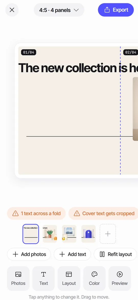 Seam CheckFinds text cut by a fold between panels and moves it for you.3Shows what the 3:4 profile grid crops from your first panel.
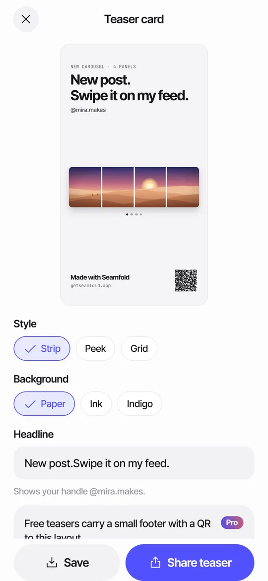 Story Teaser Card for Carousel PostsA 9:16 story card with the full spread, a headline and a QR code to the layout.
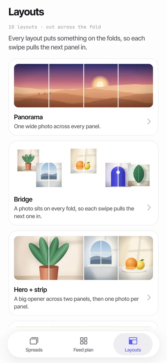 Panorama Splitter for Social Carousels on iPhoneCut a panorama into 2 to 20 panels, or build a spread from several photos with 10 layouts.