 Seamfold
Carousel size and aspect ratio
The standard carousel panel is 1080 px wide and 1350 px tall, a 4:5 portrait. You can also use 3:4 at 1080 x 1440 or a 1:1 square at 1080 x 1080. A carousel holds up to 20 slides, and every slide in the same post should share one ratio.
Coming soon to iPhone
What are the sizes?
Three ratios cover almost every carousel. All of them are 1080 px wide, which is the width the social app displays at.
| Ratio | Pixels | Best for |
|---|---|---|
| 4:5 | 1080 x 1350 | The usual feed portrait, more screen than a square |
| 3:4 | 1080 x 1440 | Full-height portrait that matches the profile grid tile |
| 1:1 | 1080 x 1080 | Square posts, easy to crop from older photos |
What size is a carousel with 3, 5 or 10 slides?
Each slide is 1080 px wide in a normal carousel, so the number of slides changes the width of a seamless spread and nothing else. Height stays at 1,350, 1,440 or 1,080 px depending on the ratio. The table gives the total width of the spread you design, which is panels times 1080.
| Slides | Spread width | 4:5 spread | 3:4 spread | 1:1 spread |
|---|---|---|---|---|
| 3 | 3,240 px | 3,240 x 1,350 | 3,240 x 1,440 | 3,240 x 1,080 |
| 4 | 4,320 px | 4,320 x 1,350 | 4,320 x 1,440 | 4,320 x 1,080 |
| 5 | 5,400 px | 5,400 x 1,350 | 5,400 x 1,440 | 5,400 x 1,080 |
| 6 | 6,480 px | 6,480 x 1,350 | 6,480 x 1,440 | 6,480 x 1,080 |
| 10 | 10,800 px | 10,800 x 1,350 | 10,800 x 1,440 | 10,800 x 1,080 |
How many slides can I post?
Up to 20. The social app raised the limit from 10 to 20 in 2024. A panorama carousel still reads best with 3 to 6 panels, since each swipe is a decision for the viewer.
Why does the ratio matter for the profile grid?
Since early 2025 the profile grid shows 3:4 tiles. Guides to the new grid put a 4:5 post at about 1013 x 1350 px inside that tile. A 3:4 post is shown whole, while a square loses about a quarter of its width. Native 3:4 uploads were also accepted in 2025.
Guides disagreed when the change first rolled out, so test with your own account if exact pixels matter. The 3:4 grid cover guide has the details.
Which ratio should you pick?
Pick by what you care about most.
- Choose 4:5 if you want the standard feed look and accept that the grid trims a thin strip from each side of panel 1.
- Choose 3:4 if you want the grid tile to show the entire cover and do not mind a slightly taller post.
- Choose 1:1 if your source photos are square or you want a classic look, and keep titles centered because the grid trims the sides.
Which ratio fits which kind of post?
Match the ratio to the job. A portrait panel fills more of the phone screen than a square, which is why 4:5 is the default for photos. A square is easiest when your source is square already, and 3:4 is the pick when you care about the grid.
The table sets out the choice by goal. If two goals conflict, rank them: profile look first, feed look first, or source shape first.
| If you care most about | Pick | Because |
|---|---|---|
| The profile grid showing the full cover | 3:4 | The tile is 3:4, so nothing is trimmed |
| Taking the most space in the feed | 4:5 | It is the tallest standard feed ratio |
| Square sources and a classic look | 1:1 | No cropping of square photos, but the grid trims the sides |
| A panorama with a wide horizon | 4:5 or 1:1 | A shorter panel makes a wider strip, so a panorama needs less cropping |
What is the right size for a seamless panorama?
Multiply the panel width by the panel count. Four panels at 1080 px make a 4,320 px spread. The matching heights are 1,350, 1,440 or 1,080 px. An image is described by its width-to-height ratio (Wikipedia: Aspect ratio), so a 4-panel 4:5 spread has a 3.2:1 ratio.
Step-by-step cutting is covered in how to split a panorama for social media.
Does the size of the source photo matter?
Yes, because a tiny photo stretched over many slides looks soft. The aim is about 1080 px of source for every slide. A 5-slide spread wants a photo near 5,400 px wide once it is scaled to fill the height.
Modern phone cameras give you more than enough for three or four panels. A 12-megapixel photo is about 4,000 px on its long side, which is a little under four panels. A photo from a 48-megapixel main camera has roughly twice as many pixels on that side, so six panels stay sharp. Seamfold shows a chip, for example 1 photo may look soft, when a photo has less than 1080 px per panel.
How big should the text be on a 1080 px slide?
Big enough to read at about a third of its pixel size. A typical iPhone screen is roughly 390 points wide, so a 1080 px slide is shown at about 36 percent of its pixel width. Body text of 14 points on screen is therefore about 39 px on the slide, and anything smaller than that starts to strain.
For a headline, 100 px or more works well on a slide. In a seamless spread, keep each word clear of the folds, because a word that is cut by a fold has to be read twice. The seamless carousel guide covers the check.
Is 1080 px enough for a sharp slide?
For the social app, yes. The phone screen has more pixels than 1080 across, but the post is delivered at 1080 px wide, so a bigger file is scaled back down on upload. What improves the look is a clean file and a source that is not stretched. If a slide still looks soft, the cause is usually an undersized source photo or a second round of compression from re-saving, not the 1080 px size itself.
What about stories and the teaser?
Stories use a vertical 9:16 frame, which is 1080 x 1920 px. A teaser that announces a carousel in stories should use that size so it fills the screen. Seamfold's teaser card is exported at 1080 x 1920 px as a PNG.
What about a short video cover or a profile picture?
A short video cover is a tall 1080 x 1920 px image, and the grid cuts it down to a 3:4 window, as the 3:4 grid cover guide explains. A profile picture is a separate case: it is shown as a circle, so a square source with the face in the middle works. Neither one is a carousel panel, so design them on their own canvas.
Common size mistakes
- Exporting wider than 1080 px per panel. The social app resizes anything wider, so the extra pixels go to waste.
- Mixing ratios across slides, which makes the first slide decide the frame for the rest.
- Designing a title at the very edge of a 4:5 or square cover, where the profile grid trims it.
- Using a tiny source for many panels, which turns the image soft.
Can the ratios be mixed in one carousel?
The social app applies the ratio of the first slide to the whole carousel, so keep every panel the same size. In a panorama carousel this is automatic, because all panels come from one spread.
How do you check the real pixel size of a panel?
Open the exported panels in the Photos app, swipe up on one to see its details and read the dimensions. Every panel should show the same width and height. If one differs, the export came from a different batch.
- Open the panel in Photos.
- Swipe up or tap the info button to see the file details.
- Check that the width is 1080 px and the height matches your ratio.
- Repeat for the first and last panel. If both match, the others do.
Which format and quality should I export?
PNG or high-quality JPEG both work. The social app re-compresses uploads, so edit once, export at 1080 px wide and avoid re-saving. Seamfold exports PNG panels at 1080 px wide and cuts pure panoramas from the original file for the best resolution.
A one-minute size checklist
Run through these before you export.
- All slides share one ratio, picked from 4:5, 3:4 or 1:1.
- Every slide is 1080 px wide, with a height of 1,350, 1,440 or 1,080 px.
- The source gives about 1080 px per slide, or you have fewer slides.
- Titles on slide 1 sit inside the middle 3:4 window.
- Text at least about 40 px tall, away from the folds.
- You exported once, in one batch, and you will not re-crop in the composer.
Frequently asked questions
What is the best size for a carousel in 2026?
1080 x 1350 px (4:5) is the standard. Use 1080 x 1440 (3:4) when you want the profile grid to show the whole first slide.
What is the maximum number of carousel slides?
20, since the 2024 expansion.
Can carousel slides have different aspect ratios?
The social app uses the first slide's ratio for the post, so use one ratio for all slides.
What size is a seamless carousel of 5 panels?
5,400 px wide and 1,350 px tall at 4:5, which is 5 panels of 1080 x 1350 px.
Does Seamfold support all three ratios?
Yes. Seamfold offers 4:5, 3:4 and 1:1 on the free plan. It is in development, so see features for the planned release.
What size is a carousel for 10 slides?
Each slide is 1080 px wide, so a seamless 10-slide spread is 10,800 px wide and 1,350 px tall at 4:5. A spread that long asks a lot of the source photo.
Keep exploring
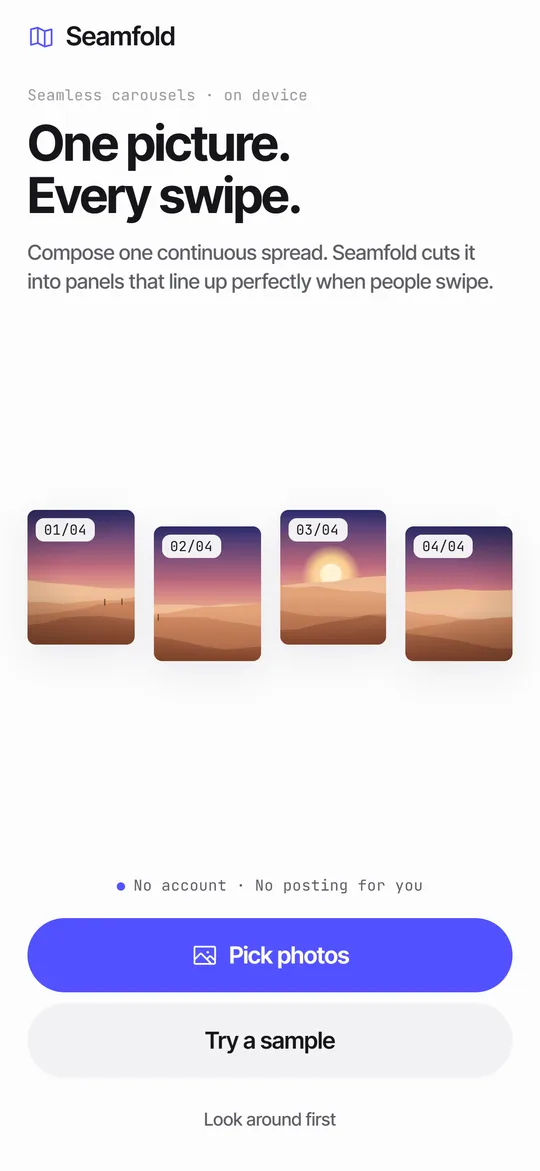 How to Split a Panorama for a Carousel, With SizesPanel counts, pixel widths and the steps to cut a panorama into a carousel.
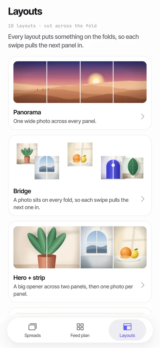 Panorama Splitter for Social Carousels on iPhoneCut a panorama into 2 to 20 panels, or build a spread from several photos with 10 layouts.How to Make a Seamless Carousel on iPhoneFive steps from one wide picture to a swipe post whose panels line up.Why Is My Carousel Blurry? Causes and FixesFour causes of blurry carousel slides and a quick fix for each.