 Seamfold
The 3:4 profile grid and your carousel cover
The profile grid of the social app you post to shows posts as 3:4 tiles. A 4:5 cover is trimmed by about 34 px on each side, a square by about a quarter of its width, and a 3:4 cover is shown whole. Keep titles and faces in the middle three quarters of panel 1.
Coming soon to iPhone
What changed in the grid?
Profile grids moved from square tiles to vertical ones in 2025. Sources differed at first. Some described 4:5 previews in February 2025, while later guides settled on 3:4 tiles and put the crop of a 4:5 post at 1013 x 1350 px. The layout can change again, so verify on your own profile.
How much does each ratio lose?
The grid tile keeps the middle of a cover. The numbers below follow from the geometry of a 3:4 window.
| Cover | Visible in the grid | Trimmed |
|---|---|---|
| 4:5 (1080 x 1350) | About 1,013 x 1,350 px | About 34 px on each side |
| 1:1 (1080 x 1080) | 810 x 1,080 px | 135 px on each side |
| 3:4 (1080 x 1440) | The whole panel | Nothing |
Where exactly is the safe area, in pixels?
Measure from the left edge of panel 1. The grid window is as wide as three quarters of the panel height, centered. For a 4:5 cover that is 1350 x 0.75, about 1,013 px, which leaves about 34 px on each side. For a square it is 1080 x 0.75 = 810 px, which leaves 135 px on each side.
Anything with an x position inside the range below is visible in the tile. Everything outside it stays in the post and the swipe, but not in the grid.
| Cover | Safe range on the x axis | Window width |
|---|---|---|
| 4:5 (1080 x 1350) | 34 to 1,046 px | About 1,013 px |
| 1:1 (1080 x 1080) | 135 to 945 px | 810 px |
| 3:4 (1080 x 1440) | 0 to 1,080 px | 1,080 px |
What does this mean for a carousel?
Only panel 1 appears in the grid, so it is the only panel that gets cropped there. A title that sits 20 px from the edge of a 4:5 cover disappears in the tile while staying fully visible in the post. In a seamless carousel the first panel also carries the start of the picture, which makes the edge a likely place for a headline.
A worked example with a centered title
Picture a square cover with a headline 900 px wide, centered. It runs from x = 90 to x = 990. The grid window starts at 135 and ends at 945, so 45 px of the headline is lost on each side. The first and last letters would be clipped in the tile while looking fine in the post.
Make the headline 780 px wide instead and it fits with a few pixels to spare. If it needs to be larger, break it into two lines. On a 4:5 cover the same 900 px headline fits easily, since the window is 1,013 px wide.
How do you check it by hand?
Seamfold does this for you. Cover check shades the cropped zone on panel 1 and labels the result Cover safe or Cover is cropped.
- Take panel 1 at its export size.
- Draw a window with a 3:4 ratio and the same height, centered.
- Keep titles, faces and logos inside the window.
- If a title needs more space, move it inward or switch the post to 3:4.
What does the cover check say in Seamfold?
It uses one of three labels, and each one means something different. The first tap on the chip draws the grid window on panel 1, with the trimmed edges shaded. When text is cut, a second tap moves the text inside the window.
- Cover safe: the cover is 3:4, so the grid shows all of it.
- Cover safe · edges trimmed: the grid will crop the sides, but no text sits in the cropped strip.
- Cover text gets cropped: a text layer overlaps the cropped strip. Tap the chip again and it moves, and shrinks if it must, to sit inside the window.
What about short video covers?
Short videos use 1080 x 1920 px covers, but the grid cuts them down to 3:4, so text near the top or bottom can be chopped. The same rule applies: keep the important part in the middle area. Carousels are easier, since you control the first panel and its ratio.
How should you design a cover that survives the crop?
Design for the tile first and the post second. Place the one thing people must see in the middle, leave a margin of at least 60 px from each side on a 4:5 cover, and let the background or photo run all the way to the edge, so that the crop trims only scenery.
The rule of thirds, a common guideline that splits an image into nine equal parts, also helps here. A subject on the left or right third line stays inside a 4:5 window but not always inside a square one.
A checklist before you post
- Panel 1 has titles and faces inside the central 3:4 area.
- You know whether the post is 4:5, 3:4 or square.
- The cover looks good as a small tile, not only full size.
- The tile sits well next to its neighbors in the grid.
Should you export at 3:4 instead?
If grid look matters most, yes. A 3:4 post at 1080 x 1440 px shows whole in the tile, so what you design is what visitors see. The social app began accepting native 3:4 uploads in 2025. The cost is a slightly taller post in the feed. The carousel size guide compares the options.
What about a seamless carousel with a headline across panels?
The headline's first letters sit near the left edge of panel 1, which is exactly where the grid trims. Start the headline about 150 px in from the left edge. That clears the 135 px the grid trims from a square cover and the 34 px it trims from a 4:5 cover. The swipe will still read left to right, and the tile will show the headline from its first letter.
How do you see the whole grid at once?
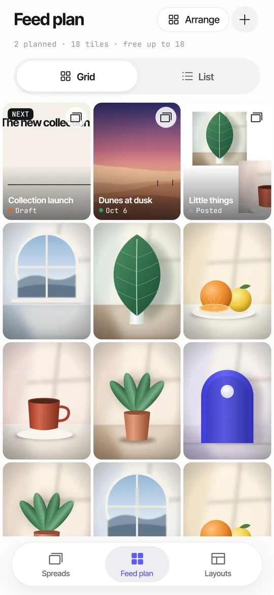
A grid preview that mixes planned covers with posts you already have shows the rhythm of colors and crops before you commit. Seamfold's feed plan draws 3:4 tiles for this, and swipe test ends with a row that shows the new cover in the middle of three tiles.
Will the grid change again?
It might. The social app has changed the profile grid before, and guides disagreed while the 3:4 tiles rolled out. So keep your source files and treat the safe area as a setting, not a fact of nature. If the crop changes again, you can open the spread, change the ratio in the Panels sheet and run the cover check again. Seamfold keeps your spread as an editable canvas, so you are not stuck with flattened images.
Which cover mistakes show up most?
Most cropped covers come from the same few habits. The list is short, and each item is a quick fix.
- A title set flush left at the margin of a design that was drawn as a full-width square.
- A logo or handle in a corner, which is the first thing the crop removes.
- A face placed near one edge of a wide cover, so the tile shows half of it.
- A cover that works at full size and turns to noise when it is the size of a thumbnail.
- A cover made for a short video at 9:16 and reused for a post without a second look.
Frequently asked questions
What size are profile grid thumbnails?
They are 3:4 tiles. A 4:5 post of 1080 x 1350 is cropped to about 1013 x 1350 there.
Does the grid crop affect the post itself?
No. The full image stays in the post and the swipe. Only the profile tile is cropped.
How do I stop the social app from cropping my cover?
Post at 3:4 (1080 x 1440), or keep important content inside the central 3:4 area of panel 1.
Can Seamfold show the grid crop?
Yes, the cover check shades the cropped area. The app is in development, see features.
How far from the edge should text be on a 4:5 cover?
At least 34 px, the width of the strip the grid trims on each side. A margin of 60 px or more leaves some room.
Is a square cover cropped in the grid?
Yes. The 3:4 tile shows the middle 810 px of a 1080 px square, so 135 px is trimmed on each side.
Keep exploring
 Feed Planner That Stays on Your iPhoneA local 3-column grid of planned covers and posted photos, with dates, status and captions.How to Make a Seamless Carousel on iPhoneFive steps from one wide picture to a swipe post whose panels line up.Grid Splitter vs Carousel SplitterWhat each tool does, sizes, posting order, and which one fits a panorama, a banner or a puzzle.