 Seamfold
How to put text across carousel slides
A headline can run across carousel slides if each word sits whole on one slide. Treat the folds between slides as walls, leave a gap of about 4 percent of the slide width on each side, set the type at 100 px or more, and check the result by swiping through before you post.
Coming soon to iPhone
Can text run across carousel slides?
Yes, and it makes a strong effect: the headline starts on slide 1 and finishes on slide 2, so the viewer swipes to read it. The risk is a word that is cut by a fold, because half the word is visible on each slide and the swipe happens mid-word. The fix is a layout where every word belongs to one slide, even if the sentence crosses the folds between words.
How big is the safe gap at a fold?
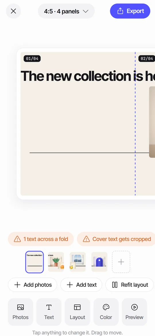
Plan on a small margin, about 4 percent of the slide width, which is roughly 43 px on a 1080 px slide. That is the room Seamfold's seam check allows before it calls a text box cut: a box that stops short of a fold by that much counts as clear, and a box that covers the fold by more counts as cut. Use a larger gap, 60 to 80 px, if you are doing it by hand, since a small drift in the composer can eat the margin.
What type size should you use?
A headline of 100 px or more reads well on a 1080 px slide. A phone shows the slide at about 36 percent of its pixel width, so 100 px becomes roughly 36 points on screen. Body text of 40 px or more is the floor, and thin weights fall apart under compression. Heavy sans serif letters are the safest choice for a cross-slide headline. Keep the same size on every slide, so the line looks continuous.
How do you lay it out, step by step?
- Decide the sentence and cut it to ten words or fewer.
- Mark the folds on your canvas at every 1080 px.
- Write the words on separate text boxes or break the lines so no word touches a fold.
- Put the longest word in the middle of a slide, away from both edges.
- Check the gap at each fold, about 4 percent of the width.
- Swipe through at normal speed and read the headline aloud.
What is the Headline across layout?
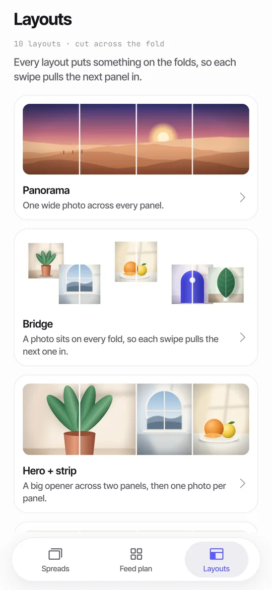
It is one of Seamfold's 10 layouts, described in the panorama splitter page. It needs 2 or more panels and places a large line of text across the folds. It is free. The seam check still flags it, because the decision is yours: leave it when the effect is intended, or tap the chip to nudge the text off the fold. The nudge moves the text to the side of the fold where most of the box already sits, and shrinks it first if it is wider than one panel.
When should you avoid text across folds?
- When the text is small, since small text fails under the swipe.
- When the sentence is long and needs more than two slides.
- When the first slide is also your profile cover, because the grid crops its edges.
- When you are not sure the viewer will swipe.
- When the words are the whole point and must be read in one place, such as a price or a date.
How do you handle the profile grid crop?
The first slide shows as a 3:4 tile in the grid, so words near its left and right edges are trimmed. For a 4:5 slide, the crop takes about 34 px from each side, and for a square it takes about 135 px. Start the headline well inside, about 150 px from the left edge of slide 1, and it will survive. The cover check shades the trimmed strips.
What contrast and color work best?
High contrast between text and background, by the same logic as web accessibility, where the WCAG contrast guidelines set minimum ratios for readable text. A good rule for images is to put the text on a calm area of the picture, such as sky, water or a wall, and avoid placing it over detail. If the background is busy, add a plain panel behind the words. In Seamfold you can change text color and pick one of 12 background colors.
Does the same rule work for photos?
Photos are meant to cross folds, because that is the point of a panorama. A face or a logo cut by a fold is a different matter and needs the same care as text. The seam check only reads text, so use the dashed fold lines in the editor to place faces and logos. The numbers such as 02/04 tell you which fold is which.
What fonts work for a headline across slides?
Heavy, simple letterforms with open spacing, because they stay readable when the slide moves. Avoid thin scripts and light weights, which break down under compression and at speed. Spacing between letters, called kerning, matters more across a fold, since a wide gap between words is a natural place to put the fold. In Seamfold the text has a display style and a mono style, with size, alignment and color controls, and you can set a line break to split a long headline into two lines.
How do you decide where to break the line?
Break at the end of a phrase, not in the middle. "Slow mornings / are worth the early alarm" splits well, with the fold between the two halves. "Slow mor / nings" does not. Read the line aloud and put the fold where you would pause. If the phrase is long, split it into two text layers, each living on one slide, and give them the same size and style so they look like one line. This also protects the first slide's title from the grid crop.
How do you test the effect?
Swipe through at normal speed, the way a follower would, and read the line once. Do not stop at the fold. If your eye catches on a word, adjust the gap. The swipe test in Seamfold hides the fold lines and shows one panel per screen with a counter such as 1/4, so you judge the result as a viewer, not as an editor.
A final check before posting
- Every word sits whole on one slide.
- The gap at each fold is at least 4 percent of the width.
- The headline is 100 px or taller.
- The first slide's title is inside the middle 3:4 window.
- You swiped through once at normal speed.
- The exported panels have no guide lines.
Frequently asked questions
Can text go across two carousel slides?
Yes, as long as no word is cut by the fold between slides. Leave a gap on each side of the fold.
How big should carousel text be?
A headline of 100 px or more on a 1080 px slide. Body text should be at least 40 px.
How much space should I leave at a fold?
About 4 percent of the slide width, roughly 43 px on a 1080 px slide, and more if you work by hand.
Does Seamfold fix text across folds automatically?
It flags text that crosses a fold, and one tap on the chip nudges it to a clear position. It is in development.
Will the social app change my text position?
Not if you keep the composer at the exported ratio. A re-crop in the composer shifts the folds.
Keep exploring
 Seam CheckFinds text cut by a fold between panels and moves it for you.How to Make a Seamless Carousel on iPhoneFive steps from one wide picture to a swipe post whose panels line up.3Shows what the 3:4 profile grid crops from your first panel.
 Panorama Splitter for Social Carousels on iPhoneCut a panorama into 2 to 20 panels, or build a spread from several photos with 10 layouts.What to Put on the Last Slide of a CarouselIdeas for the final slide of guides, photo sets and panoramas, plus layout and wording tips.