 Seamfold
Feed layout ideas for a grid that looks planned
A feed layout is a repeating rule for what each tile in the profile grid looks like. The easiest rules are a checkerboard of photo and text, rows of one color, a repeating three-post cycle and a fixed border. Pick one rule, plan nine tiles ahead and review the grid before each post.
Coming soon to iPhone
What makes a feed layout work?
A layout works when a stranger can describe it in one sentence. "Every second post is a quote on white" is a layout. "I try to keep things nice" is not. The grid shows tiles three across, newest at top left, and since 2025 each tile is a 3:4 window of your first image, so the rule has to hold in that shape.
Good layouts follow the same logic as color theory and visual hierarchy: repeat a few things on purpose so the eye can rest. Layouts are cheap to plan and expensive to repair. Once a tile is posted, the only way to move it is to delete it or pin it. That is why people sketch the next nine tiles first. A short plan beats a long one, because ideas and moods change within a month.
Which layout ideas are easy to keep?
These seven rules need no special skill. Each one is a pattern you can check with a glance at the grid.
| Layout | The rule | Best for |
|---|---|---|
| Checkerboard | Photo, text, photo, text, alternating in both directions | Creators who mix pictures with quotes or tips |
| Color rows | Each row of three shares a dominant color | Fashion, interiors, product photos |
| Three-post cycle | Wide shot, detail, portrait, then repeat | Travel and food, where variety is built in |
| Border | Every cover has the same frame or margin | Brands with a logo or a strict style |
| Light and dark | Alternating bright and dark covers | Photographers with moody sets |
| Column themes | Each of the three columns has its own subject | Accounts with three clear topics |
| Hero then support | One strong cover, then two quiet ones | Launches and series |
How do you test a layout before you commit?
Make the next nine covers as rough thumbnails and place them in a mock grid. Look at it at arm's length or squint, because that is how most visitors take in a profile. If the pattern is hard to see, it is probably too subtle, and if it shouts, it may tire people. The aim is a calm rhythm, not a poster.
- List the next nine posts and give each a cover.
- Place the covers in a 3-column grid of 3:4 tiles, newest at top left.
- Squint at it. Do you see your rule, or a random scatter?
- Swap or drop covers that break the rule, or change the rule.
- Fix the order and the date of each post.
- Re-check the grid after every post that goes live.
How do 3:4 tiles change the old advice?
Many layout guides were drawn for square tiles. In a 3:4 grid each tile is taller, so a centered square design leaves bars above and below, and a wide photo is trimmed at both sides. The practical change is to build covers in portrait, keep the subject in the middle three quarters and put a title in the middle band. The 3:4 grid crop guide gives the numbers for 4:5 and square covers.
How do carousels fit into a layout?
Only the first panel of a carousel appears in the grid, so a layout is really a rule for first panels. That is good news for panorama carousels. The first slice of a wide image can act as a color block in the grid while the whole picture appears only on swipe. A strong first panel also makes the carousel stand out from single photos in your rhythm.
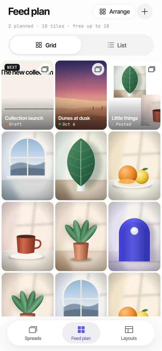
For this reason Seamfold's cover check shades the part of panel 1 that the grid will trim, and its feed plan lays your planned covers beside photos you already posted. Both run on the iPhone with no account.
What should you do when the layout slips?
Slips happen: a trip photo does not fit the rule, or a post goes up out of order. There are three honest options. You can let it be and return to the pattern, which most followers will not notice. You can pin the posts you want to lead the grid. Or you can archive the odd post, which hides it without deleting it. Avoid deleting popular posts just to protect the grid, since the reach they earned goes with them.
How many posts ahead should you plan?
Nine to twelve is enough. That is three or four rows, which is what a visitor sees without scrolling. A longer plan goes stale, and you end up posting things that no longer fit your mood or the season. Treat the plan as a draft you edit, and mark each item as draft, ready or posted so you know what is safe to rely on.
How do you choose a color palette for the grid?
Pick two or three colors and one neutral, then check every cover against them. The easy way is to sample colors from your best-performing photos and see which ones repeat. Warm skin tones, sky blue and a dark neutral appear in most travel feeds without any effort. If your photos come from different light and different cameras, a consistent edit does more for the grid than any template.
Do not chase a palette so strictly that you skip good photos. A feed that looks perfect and says nothing is worse than a feed with two odd tiles. Think of color as a background hum, and let the content lead.
What about text and photo covers?
Mixed grids work when the text covers are a recognizable family. Use the same font, the same two colors and the same margin, so a quote tile looks like it belongs to the account. Leave generous space around the words, because the 3:4 tile is read at thumbnail size on a phone, and long sentences are unreadable there. Five to eight words is a comfortable limit for a cover title.
If the text cover opens a carousel, put the title in the middle band of panel 1 so the grid window never trims it. Seamfold's cover check tells you when text sits in the trimmed strip.
Do you need to follow a layout at all?
No. Plenty of strong accounts have no visible pattern, and the photos or the personality hold them together. A layout is a tool for people who want a polished first impression, mostly brands, portfolios and creators who sell something. If you post for friends, skip the effort. If you are somewhere in between, a loose rule such as "no two dark photos in a row" gives most of the benefit for a fraction of the planning.
Layout mistakes to avoid
- Two text covers stacked in the same column, which makes a heavy block.
- A busy photo next to another busy photo, which blurs both.
- Placing key words at the very edge of a cover, where the 3:4 window trims them.
- Changing the rule every month, so the grid never forms a pattern.
- Planning thirty posts ahead and never looking at the plan again.
- Posting only for the grid and forgetting what the post says to the person who sees it in the feed.
Do you need a planner app?
Not necessarily. A folder of thumbnails and a screenshot of your grid will do. A planner helps when you want the live crop, drag-to-reorder and a caption draft in one place. If privacy matters to you, look for one that keeps files on the device. The guide to planning without an account explains what to check.
Frequently asked questions
What is the easiest feed layout?
A checkerboard is the easiest: alternate a photo post with a text or graphic post. You only decide the next tile by looking at the previous one.
How many posts should I plan ahead?
Nine to twelve, which is three or four rows of the 3-column grid. Longer plans go out of date.
Do feed layouts still matter in 2026?
They matter for visitors who land on your profile and judge it in a few seconds. They matter less for people who see only single posts in their feed.
Does the grid show the whole carousel?
No. The grid shows only the first slide, in a 3:4 window, so a layout is a rule for first slides.
Can I preview my grid without giving a planner my social app login?
Yes. Seamfold's feed plan works on the iPhone without a login and shows covers as 3:4 tiles next to photos you add yourself. It is in development.
Keep exploring
 Feed Planner That Stays on Your iPhoneA local 3-column grid of planned covers and posted photos, with dates, status and captions.Feed Planner Without an Account or CloudWhat to look for in a local feed planner and how to plan 3:4 tiles on device.The 3What the 3:4 grid crops from 4:5 and square covers, and how to keep titles inside.3Shows what the 3:4 profile grid crops from your first panel.